Business Card

Book Mark

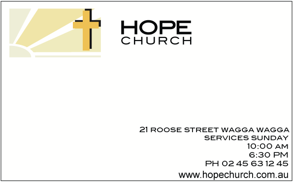
Compliment Slip
Letterhead

Front of Brochure

Middle of Brochure

The critique
On Friday eighth of may Luke and our class had a critique of each other’s work on a logo assignment on which each student had to design a business logo for either a church, hair and beauty, airport, debt collection agency, gym, acupuncturist etc. For each design the student had to create a logo, a business card, a bookmark, a letterhead with compliment slip and an A5 brochure. I decided to design for a church. For my logo I chose to do a sun rising from the left with 3 sun rays with a strong radiant cross up the top right.
The mistake that Luke and the group discussed in my logo was my choices of the two colours in my work. They did not work well together and it was not conveying the message or feel of my business. The general consensus for my logo was that one of my initial ideas for the logo worked better than the one I had chosen. The logo that was chosen by Luke and the class had more variations of yellow that the logo that I had chosen. This was because I found out that most logos only have to colours in them and I felt it would be more basic and simple.
My biggest problem in the critique was the bookmark. The colour was again slightly different to the logo colours thus it lost the unity I was trying to bring. Other aspects that let down for this assignment were small little mistakes that I just missed until after I had handed in this assignment. These were factors such as the cross missing in the logo of the middle brochure. The headings differing from upper case to sentence case in the brochure, the first page of the brochure set the wrong way round and the having the business set up in Darwin when the assignment sheet specified that the business was to be set up in Wagga Wagga. Other than these mistakes the typography was not mentioned so I decided to keep it. I thought the typography would have let me down in the critique because the type that I had elected to use did have a sense that it had had been stretched; I had catered for this though by decreasing the tracking in the headings.
The compliment slip did not get any feedback really but I wonder if that was because I was the last one and we had run out of time. I felt that the small mistakes I made let this business down and gave my Pitch an l unprofessional approach to what standard I was trying to achieve.
Overall
Overall I thought that I went well for this assignment. Although I let my pieces down, by using the same type throughout the piece unified my piece, I also thought I used the negative space in a positive way which also helped my piece. I created a simple positive logo for my client and created simple basic usable items that in my opinion have a real chance of advertising my company.
My Plans ahead
In my Assignment I want to continue to unify my work. I want to use the same colour to be the dominant one throughout my pieces. Also the colours need to be more complimentary of each other. For the logo I have decided to go with more subtle variations of my soft the yellow and finish with a gold colour for the cross. For the Brochure I have used the sun colour in my logo for the background border colour. Also the word Church needs to be tracked looser for the writing to be spaced in a box which will give it a more attractive feel. Also the Typography in the middle of my brochure needs to be aligned more and set to a standard on every page to make it easier and more legible and I want to break up my paragraphs of the lorem ipsum to give the brochure a more realistic approach, the typeface itself doesn’t need to change. I want to keep about the same opacity in all my work. I think that it adds to the softness of my piece. The logo on the bookmark could be smaller. I want to advertise my church in a friendly way without making a rash statement.
No comments:
Post a Comment