
Flipsyde logo- This idea was to have a skateboard like this with a silhouette of a person in the middle of a kickflip. However I decided to keep it simple with some graffiti like gothic syle font to enphasize the skate style theme.
Slinky-The original idea for this logo was to have a slinky in the shape of a woman. When I realized how difficult that would have been since there were no photoes i could find suiting to my idea I desided to go with the woman silhouette with the red writting. Im not sure that the gradient worked which is why I put the other other ideas down, i feel now that it need black to be more prominent through the background.
Scofield Woodwind instruments- I wanted to stay simple with this idea, I was originally going to make one of the instruments yellow for a more realistic approach however I went with the other colours because i felt that the yellow didnt work, perhaps it might have worked with a black background however i wanted to have just a blank background. I feel that the the black shadows add to this piece by giving another dimention to the basic instruments while keeping it simple. It Reinforces the black typography.
Nixons joinery- For this logo I just wanted to have a plain bench facing straight on with the nixons logo in front of it however I dont know if the type works for this piece, also im not happy with the centred text.
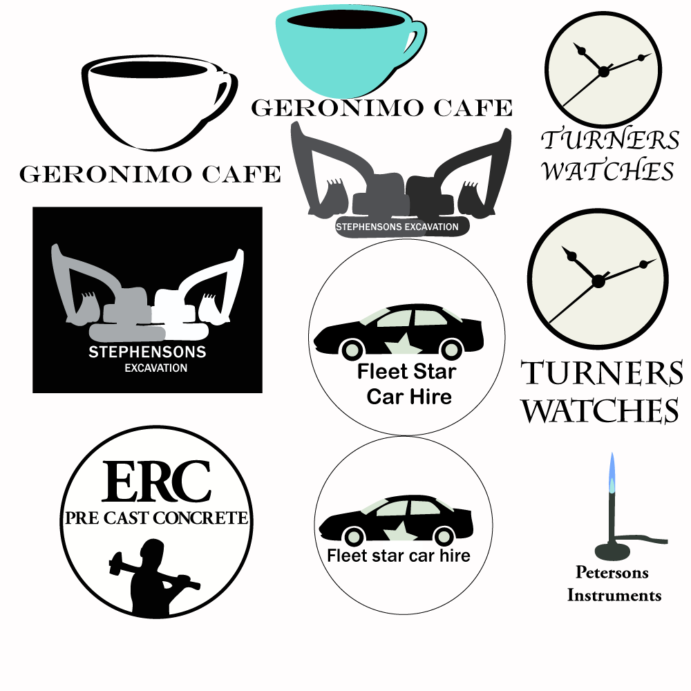
Geronimo Cafe- After reseaching existing businesses i wanted to have a stoke around one side of the coffee cup however when I tried to do this it didnt work out as I had planned, but I was happy with the images i came up with anyway. The black and white logo works but in my opinion i feel that its not eye catching enough, although it serves its purpose I think it needs some eye catching colour to appeal to customers. The other logo works but im not quite sure about the colour of the coffee mug.
Turners Watches-this is a verry simple idea that i think would be typically used for a watch business. The top writting works for the purpose of this business but might have been a bit to creative which is why i went with the safe type underneath as a backup.
Stephensons Excavations- I feel that the graphic works for this logo I kept it as simple as I could I kept it without colours because excavation is a serious business, I felt that it had to be simple because excavation is a business that doesnt necessary need to be eye catching.
ERC Pre cast concrete- This logo had to be simple like the excavation business. You do not go down the street and realise that you are going to get a concrete job done because the logo is pretty. Plus this is an expensive job so the logo had to be serious. I was originally going to have just the name with the cirle around it however i felt that it laked something which is why I used this silhouette.
Fleet Star car hire- In this logo I wanted to show a professional approach while using the word star so that this business would be momorable enough. the top logo works much better. in the lower logo the writting is to small and gets lost.
Petersons Instruments- This was a verry basic idea, I wanted to show that this was a company sold scientific instruments as soon as you look at it. The type of font enforces the professionism. however I dont know about the tube leading to nowhere purhaps a box would fix this.
No comments:
Post a Comment