
Monday, May 31, 2010
Friday, May 28, 2010

BSBDES302A

Control-For this image I just wanted to show a basic idea of control.
I thought that my image in front of 6 televisions holding a remote sufficed this need.

Chaos- or this image I wanted to have a crime scene in action. My picture in this image is the background streets.

Harmony- In this shot i just wanted an irrelevant background with the silhouettes dispaying a sense of harmony and balance by having different ages and a balance of gender throughout this piece. my shot is the silhoutte on the far right.

Dissonance- I got my inspiration for this idea by looking up the meaning in music terms. From this I decided to create a clash in this picture by splitting the image in half: One side Black and white and the other in colour to create a dissonance type feel.

Hell- if you cant tell by now, i hate snakes. i decided to use this to show my interpretation in this piece i also had a phrasing up in the top left "what are you afraid of?" but decided that i couldnt find the right type. i think that it needs something in the top left through to help balance off this piece

Heaven- I feel that this piece is self explanatory. I felt that I was limited in this piece by my own understanding. The type works for me, It is same colour as the background clouds which creates unity to the piece and it has opacity which adds to the general feel. Im not quite sure on my picture in the left side of the screen. Im dont know if it works as being the focal point Either.
Monday, May 24, 2010


I found the images on this site insightful. I like the way that there is a purpose for the type. In all of the pieces whether they look 3D or if they have a sense of movement, the type always has a sense that it has been well thought out and that it always has a unique purpose to it. It does not seem like it the type was forced into the piece. There is always a reason why it is there and it always adds a lot to the piece. It also seems that the type in most of these pictures seems like the focal point. Although they all differ the type seems to be strong. I thought the pictures were a radical way of doing type. It made me realise that when it comes to typography i can do so much more than just choose the type.

Friday, May 21, 2010
ASSIGNMENT IMPROVED
Logo

Business Card

Book Mark

Compliment Slip

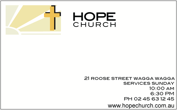
Letterhead

Front of Brochure

Middle of Brochure

The critique
On Friday eighth of may Luke and our class had a critique of each other’s work on a logo assignment on which each student had to design a business logo for either a church, hair and beauty, airport, debt collection agency, gym, acupuncturist etc. For each design the student had to create a logo, a business card, a bookmark, a letterhead with compliment slip and an A5 brochure. I decided to design for a church. For my logo I chose to do a sun rising from the left with 3 sun rays with a strong radiant cross up the top right.
The mistake that Luke and the group discussed in my logo was my choices of the two colours in my work. They did not work well together and it was not conveying the message or feel of my business. The general consensus for my logo was that one of my initial ideas for the logo worked better than the one I had chosen. The logo that was chosen by Luke and the class had more variations of yellow that the logo that I had chosen. This was because I found out that most logos only have to colours in them and I felt it would be more basic and simple.
My biggest problem in the critique was the bookmark. The colour was again slightly different to the logo colours thus it lost the unity I was trying to bring. Other aspects that let down for this assignment were small little mistakes that I just missed until after I had handed in this assignment. These were factors such as the cross missing in the logo of the middle brochure. The headings differing from upper case to sentence case in the brochure, the first page of the brochure set the wrong way round and the having the business set up in Darwin when the assignment sheet specified that the business was to be set up in Wagga Wagga. Other than these mistakes the typography was not mentioned so I decided to keep it. I thought the typography would have let me down in the critique because the type that I had elected to use did have a sense that it had had been stretched; I had catered for this though by decreasing the tracking in the headings.
The compliment slip did not get any feedback really but I wonder if that was because I was the last one and we had run out of time. I felt that the small mistakes I made let this business down and gave my Pitch an l unprofessional approach to what standard I was trying to achieve.
Overall
Overall I thought that I went well for this assignment. Although I let my pieces down, by using the same type throughout the piece unified my piece, I also thought I used the negative space in a positive way which also helped my piece. I created a simple positive logo for my client and created simple basic usable items that in my opinion have a real chance of advertising my company.
My Plans ahead
In my Assignment I want to continue to unify my work. I want to use the same colour to be the dominant one throughout my pieces. Also the colours need to be more complimentary of each other. For the logo I have decided to go with more subtle variations of my soft the yellow and finish with a gold colour for the cross. For the Brochure I have used the sun colour in my logo for the background border colour. Also the word Church needs to be tracked looser for the writing to be spaced in a box which will give it a more attractive feel. Also the Typography in the middle of my brochure needs to be aligned more and set to a standard on every page to make it easier and more legible and I want to break up my paragraphs of the lorem ipsum to give the brochure a more realistic approach, the typeface itself doesn’t need to change. I want to keep about the same opacity in all my work. I think that it adds to the softness of my piece. The logo on the bookmark could be smaller. I want to advertise my church in a friendly way without making a rash statement.
Business Card

Book Mark

Compliment Slip
Letterhead

Front of Brochure

Middle of Brochure

The critique
On Friday eighth of may Luke and our class had a critique of each other’s work on a logo assignment on which each student had to design a business logo for either a church, hair and beauty, airport, debt collection agency, gym, acupuncturist etc. For each design the student had to create a logo, a business card, a bookmark, a letterhead with compliment slip and an A5 brochure. I decided to design for a church. For my logo I chose to do a sun rising from the left with 3 sun rays with a strong radiant cross up the top right.
The mistake that Luke and the group discussed in my logo was my choices of the two colours in my work. They did not work well together and it was not conveying the message or feel of my business. The general consensus for my logo was that one of my initial ideas for the logo worked better than the one I had chosen. The logo that was chosen by Luke and the class had more variations of yellow that the logo that I had chosen. This was because I found out that most logos only have to colours in them and I felt it would be more basic and simple.
My biggest problem in the critique was the bookmark. The colour was again slightly different to the logo colours thus it lost the unity I was trying to bring. Other aspects that let down for this assignment were small little mistakes that I just missed until after I had handed in this assignment. These were factors such as the cross missing in the logo of the middle brochure. The headings differing from upper case to sentence case in the brochure, the first page of the brochure set the wrong way round and the having the business set up in Darwin when the assignment sheet specified that the business was to be set up in Wagga Wagga. Other than these mistakes the typography was not mentioned so I decided to keep it. I thought the typography would have let me down in the critique because the type that I had elected to use did have a sense that it had had been stretched; I had catered for this though by decreasing the tracking in the headings.
The compliment slip did not get any feedback really but I wonder if that was because I was the last one and we had run out of time. I felt that the small mistakes I made let this business down and gave my Pitch an l unprofessional approach to what standard I was trying to achieve.
Overall
Overall I thought that I went well for this assignment. Although I let my pieces down, by using the same type throughout the piece unified my piece, I also thought I used the negative space in a positive way which also helped my piece. I created a simple positive logo for my client and created simple basic usable items that in my opinion have a real chance of advertising my company.
My Plans ahead
In my Assignment I want to continue to unify my work. I want to use the same colour to be the dominant one throughout my pieces. Also the colours need to be more complimentary of each other. For the logo I have decided to go with more subtle variations of my soft the yellow and finish with a gold colour for the cross. For the Brochure I have used the sun colour in my logo for the background border colour. Also the word Church needs to be tracked looser for the writing to be spaced in a box which will give it a more attractive feel. Also the Typography in the middle of my brochure needs to be aligned more and set to a standard on every page to make it easier and more legible and I want to break up my paragraphs of the lorem ipsum to give the brochure a more realistic approach, the typeface itself doesn’t need to change. I want to keep about the same opacity in all my work. I think that it adds to the softness of my piece. The logo on the bookmark could be smaller. I want to advertise my church in a friendly way without making a rash statement.
Tuesday, May 18, 2010

Tuesday, May 11, 2010


Logo assignment
Front of Brosure

Middle of Brosure

Letterhead

Compliment slip

Book mark

Business Card

Logo

Initial designs logo


Middle of Brosure

Letterhead

Compliment slip

Book mark

Business Card

Logo
Initial designs logo

Tuesday, May 4, 2010
10 logos done in Illustrator

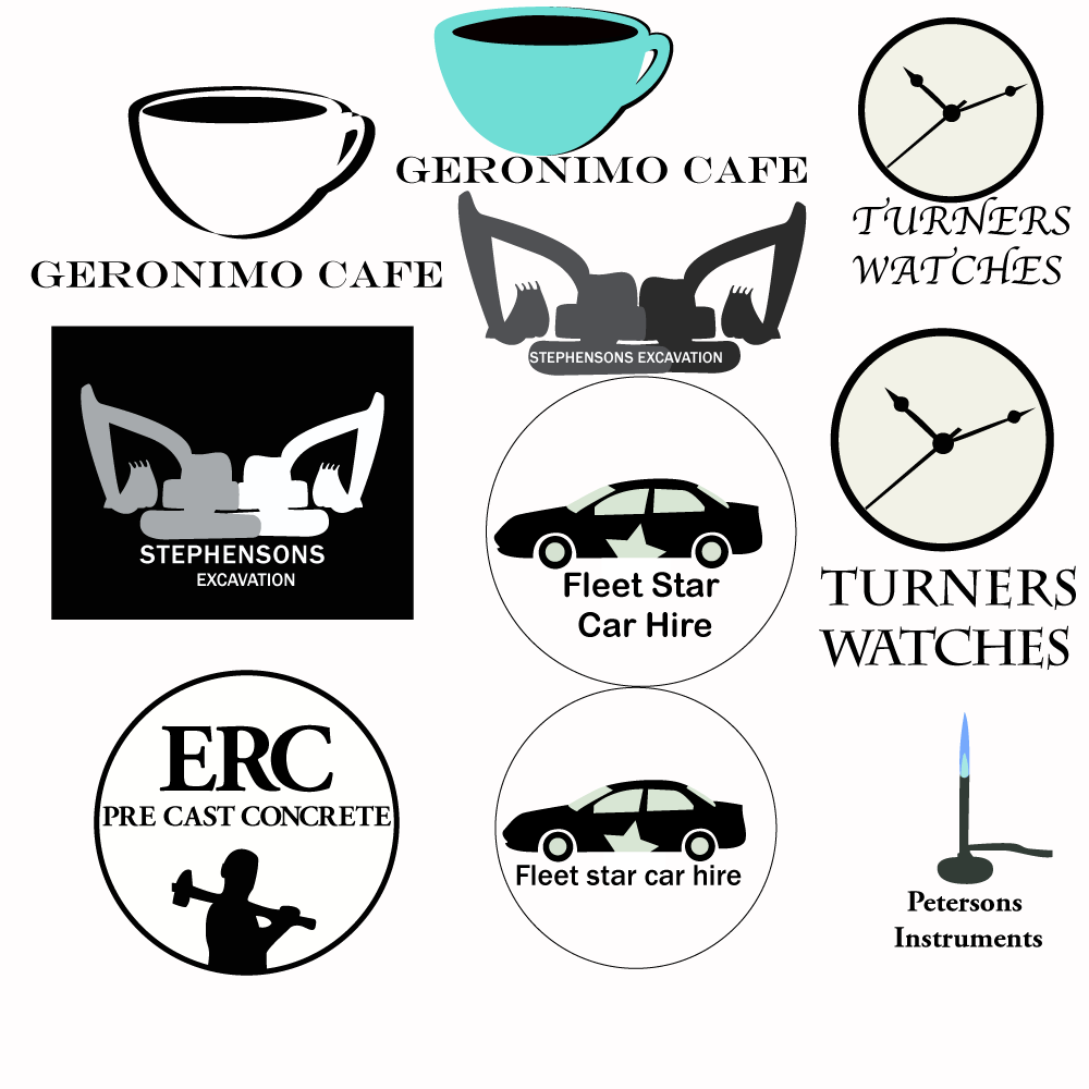
Flipsyde logo- This idea was to have a skateboard like this with a silhouette of a person in the middle of a kickflip. However I decided to keep it simple with some graffiti like gothic syle font to enphasize the skate style theme.
Slinky-The original idea for this logo was to have a slinky in the shape of a woman. When I realized how difficult that would have been since there were no photoes i could find suiting to my idea I desided to go with the woman silhouette with the red writting. Im not sure that the gradient worked which is why I put the other other ideas down, i feel now that it need black to be more prominent through the background.
Scofield Woodwind instruments- I wanted to stay simple with this idea, I was originally going to make one of the instruments yellow for a more realistic approach however I went with the other colours because i felt that the yellow didnt work, perhaps it might have worked with a black background however i wanted to have just a blank background. I feel that the the black shadows add to this piece by giving another dimention to the basic instruments while keeping it simple. It Reinforces the black typography.
Nixons joinery- For this logo I just wanted to have a plain bench facing straight on with the nixons logo in front of it however I dont know if the type works for this piece, also im not happy with the centred text.
Geronimo Cafe- After reseaching existing businesses i wanted to have a stoke around one side of the coffee cup however when I tried to do this it didnt work out as I had planned, but I was happy with the images i came up with anyway. The black and white logo works but in my opinion i feel that its not eye catching enough, although it serves its purpose I think it needs some eye catching colour to appeal to customers. The other logo works but im not quite sure about the colour of the coffee mug.
Turners Watches-this is a verry simple idea that i think would be typically used for a watch business. The top writting works for the purpose of this business but might have been a bit to creative which is why i went with the safe type underneath as a backup.
Stephensons Excavations- I feel that the graphic works for this logo I kept it as simple as I could I kept it without colours because excavation is a serious business, I felt that it had to be simple because excavation is a business that doesnt necessary need to be eye catching.
ERC Pre cast concrete- This logo had to be simple like the excavation business. You do not go down the street and realise that you are going to get a concrete job done because the logo is pretty. Plus this is an expensive job so the logo had to be serious. I was originally going to have just the name with the cirle around it however i felt that it laked something which is why I used this silhouette.
Fleet Star car hire- In this logo I wanted to show a professional approach while using the word star so that this business would be momorable enough. the top logo works much better. in the lower logo the writting is to small and gets lost.
Petersons Instruments- This was a verry basic idea, I wanted to show that this was a company sold scientific instruments as soon as you look at it. The type of font enforces the professionism. however I dont know about the tube leading to nowhere purhaps a box would fix this.
Sunday, May 2, 2010
Typography

I like the typography in this picture with the scrambled letters and clutter adding to the vomit dispay and the mixture of red and black working well.

The type works for this picture using type that is simple and easily read for a reflection type style poster. I dont know if the cracks in the font work though as it takes away from the composition.

I think that the forground type written over the background text does not work. However this picture has proven insightful in my own learning.

Another ugly piece but a good statement brought through. Purely looking at this for if the type. The tracking needed to be further apart.

The contrast of colour through the picture is very clear, however I dont know about using all the different type faces and sizes throughout this picture.

This picture I feel executes the idea of the previous picture perfectly. The square type font works perfectly for this photo.

the colour works brilliantly for this picture, it adds to the picture that there are only really 1 types of colours in this and just different shading.

The type works for this picture, the font style also works in the simplicity with only the size differing. The simplicity of this text type highlights the typography and accentuates the style.

I do not think that the typography, written with different angles and sizes it gives an amature appearance.

I dont know if there is a purpose for this type in this picture. I do like the blend of the colour of the type with the light blue but the really small font doesn't work in my opinion.
Subscribe to:
Posts (Atom)