Thursday, February 25, 2010


I think this logo is good because it displays a simple message to its target marget. While doing this the simple graphics of the picture capture the eye i feel. This logo is effectively because while targeting the market of a childish age it also does not look unprofessional. The text goes from light blue to dark which matches with the tooth which adds unity.


I like this logo because i find that it displays an effective message to its market. the graphics are simple and easy to look at. the colours are right for its clients, and the use of the picket fence adds to the sence of country. i think that the use of colours and the simple text makes the logo feel "home made" which helps effectively communicate with the country region.


i like this logo because the tooth is simple but also is an effective graphic to be able to identify with the clients without the use of the text. i think that this is a very simple graphic while still being professional. i like how the tooth hasnt been fully enclosed as well which purhaps gives it a "slick" approach.


i think that this logo is effective because it is eye catching and its wording and graphics are simple. i also think that this logo is effective because it conveys the message well without having to refer to being a gym the hand squashing the crunch text gives the impression that this gym is full paced as well. This gym is also in your face but not to much to draw away from its customers.


i think this is a good logo because the contrast between the yellow and the black sets a eye catching scene. this would be an effective way to catch the customers gaze. I also think that it has a professional approach to it as well.


i think this logo is effective because the contrast between red and white between the flower sets a professional yet effective graphic. it also works well with the mixture of colour in the font. i feel this logo works well because the mixture of the two colours work well and it is short and to the point so that people can identify the company quickely. I also think the mixture of Red and yellow also creates a romantic feel which adds to this logo.


i like this logo because like the logo above it is simple the colours work together the graphic is simple enough to identify quickely and overall the logo is simple enough to be able to identify quickely. I also like how the font is verry simple as well.


I like this graphic because the mixtureof colours work. the font is easy enough to read while there are small graphics as well to emphasise that this is a florist. I think this logo works because the two lite colours mixed with the plain writing works to effectively advertise this business.


Wednesday, February 17, 2010


10 Shots by photographers
1.This shot is by robert adams i like the black and white feel over the city. It creates an old fasion shot i feel. I also like the fact that the trees are darker than the city it could mean that it is night.

2.This shot is by Martin Parr. I like this shot because it is interesting to me why he put the shoe in the middle of the shot. i like that the focus is on the people behind him and that the shoe is blurred.

3.this shot is by Tony Vaccaro. I like this shot because it simblises a verry significant event, coming back from war or going to war. This photo depicts human expression well in the looks on the women faces.

4.This shot is by richard billingham. I like how the photo is intriging and how it jumps out at you when you look at it the first time. I also like the fact that the contrast between light and dark in this shot.

5.This photo is by Araki. I like this photo for his effective capture of human emotion. This photo entrigues me and gets me asking why. Why is this woman sad in a lake. I like that the senery also captures wht emotion is expressed on her face at the time.


6.This picture by cindy sherman depicts a sense of adventure. I like the fact that she went with the black and white to depict older times. I also like that the picture is taken from the bottom up which to me is trying to show that the world is your oyster.


7.I love this image by jeff wall because it captures each persons emotions so well for that split time. i believe that although this image only has a couple of things in it. they are enough to capture and intrigue the veiwer.

8.the first picture up the top is by Larry Clark. I love the way the photo is so confronting. because it is something that you would not normally expect it may be contravercial as well. I also think that because of the black and white approch it adds to the photo.

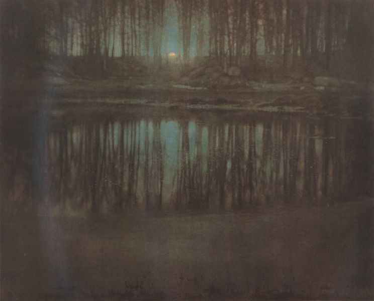
9.This picture is by Edward Steichman. I think this picture is brilliant because it captures so much in the image. I also like that the only source of light in this image is the small fragment of the moonlight but yet it is enough to capture the image perfectly.


10.This picture is done by Gregory Credson. I really like the lighting for this picture. The contrast between the lighting in th middle to the outside of the picture beeing dark or darker adds a lot to the picture. Also the fact that the lighting of the peoples faces and that they show no emotion creates the idea of the picture look fake.


Thursday, February 11, 2010

Today we played a game called get the glass. I thought that the graphics and the contrast of colour was exelllent. The designer really went to the effort of making the game pleasing to look at and it was obvious that it was Proffesional done job, however i thought that the graphics were designed for a much younger group then what the game was trying to target.

I found that the game was all about the graphics and how it looked rather then about the game itself. The difference of the difficulty in the challenges was also anoying and a little confusing. The change of going from a level where you have to navigate a car through a course to asking questions about different reactions of people was a little irritating, sometimes the writting was a little to fast to read too. Overall i thought the graphics were exellent and the game play was bad.

Tuesday, February 9, 2010

how you doin this is mitch this is my first blog hope it works